在 CSS 动画中,我们平常都会通过 CSS Animation 和 CSS Transform 等实现一些简单的 CSS 动画。然而,要想让动画对象沿着一条路径进行移动,还是有一些难点的。CSS Motion Path 标准的出现,让开发者能够给动画对象定义一条动画路径,配合 keyframe 等操作,轻松实现让一个物体沿着一条路径进行动画。
Motion Path Level 1 从 2015 年 4 月 9 日发表第一个工作草案以来,经过3年多的时间,发展得已经比较成熟了,同时 Google Chrome、Opera 浏览器也是第一批能够支持大部分草案标准功能的浏览器。
下面我们就来了解一下吧。
动作路径
既然是要让对象沿着一条路径走,那么本标准中最重要的点就在如何定义路径上了。
offset-path
offset-path 即为定义路径的属性,它能够接受 ray()、CSS Shaps 中的图形 以及能够接受类似 SVG 路径定义的 path()。
在 Chrome 中,目前叫 motion-path
ray()
ray()即为辐射线。它以容器的中心为圆心,在容器中嵌入一个能够嵌入的最大圆形,结合自定义的夹角,将圆心与边上的点相连,形成路径。
ray接受三个参数,分别是角度,大小以及设置是否让对象完全包含在路径内。
用下面的例子进行一一解释
<style>
  body {
    transform-style: preserve-3d;
    width: 200px;
    height: 200px;
  }
  .box {
    width: 50px;
    height: 50px;
    offset-position: 50% 50%;
    offset-distance: 100%;
    offset-rotate: 0deg;
  }
  #redBox {
    background-color: red;
    offset-path: ray(45deg closest-side);
  }
  #blueBox {
    background-color: blue;
    offset-path: ray(180deg closest-side);
  }
</style>
<body>
  <div class="box" id="redBox"></div>
  <div class="box" id="blueBox"></div>
</body>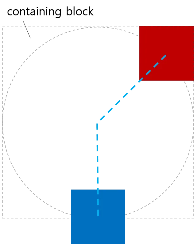
角度
即 CSS 中的角度定义,如上图,45deg 和 90deg 分别形成 45 度和 90 度的夹角。
大小
第二个大小参数决定了路径的长短,它支持以下的属性
| 属性值 | 含义 |
|---|---|
| closest-side | 初始位置到最近一边的距离 |
| closest-corner | 初始位置到最近一角的距离 |
| farthest-side | 初始位置到最远一遍的距离 |
| farthest-corner | 初始位置到最远一角的距离 |
| sides | 初始位置到交线的距离 |
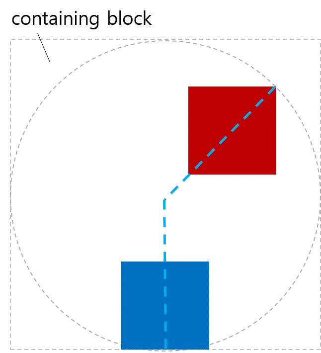
contain
设置对象是否完全包含在路径之中
如果上述例子设置了 conatin,两个 box 将会完全包含在路径之内
offset-path: ray(90deg, closest-side, contain)
CSS 图形
我们还能利用 CSS 中的形状来定义动作路径,CSS 中的形状我们已经不陌生了,例如inset() , circle(), ellipse(), polygon(),甚至还能使用盒模型的数值如 margin-box, border-box, padding-box, content-box。
下面这个例子使用了 margin-box 的边作为动作路径:
<style>
  body {
    width: 500px;
    height: 300px;
    border-radius: 80px;
    border: dashed aqua;
    margin: 0;
  }
  #blueBox {
    width: 40px;
    height: 20px;
    background-color: blue;
    offset-path: margin-box;
  }
</style>
<body>
  <div id="blueBox"></div>
</body>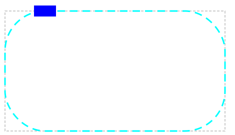
path()
path() 可以接受 SVG 中的几何描述数据作为动作路径
.path {
  offset-path: path('M150 0 L75 200 L225 200 Z');
}
如上代码使用 SVG 描述一个三角形,那么这个对象的动作路径即为这个三角形,那么他的初始位置以及初始方向,可以参考 SVG 相关标准进行设定。
url
url 与 上面的 path() 相同,path() 直接将 SVG 几何描述内容写到 CSS 中,url 则可以直接引用 SVG 文件。
offset-distance
offset-distance 用于设定对象在路径上的位置。
<style>
  body {
    transform-style: preserve-3d;
    width: 300px;
    height: 300px;
    border: dashed gray;
    border-radius: 50%;
  }
  .circleBox {
    position: absolute;
    left: 50%;
    top: 50%;
    width: 40px;
    height: 40px;
    background-color: red;
    border-radius: 50%;
  }
  #circle1 {
    offset-path: ray(0deg farthest-side);
    offset-distance: 50%;
  }
  #circle2 {
    offset-path: ray(90deg farthest-side);
    offset-distance: 20%;
  }
  #circle3 {
    offset-path: ray(225deg farthest-side);
    offset-distance: 100%;
  }
</style>
<body>
  <div class="circleBox" id="circle1"></div>
  <div class="circleBox" id="circle2"></div>
  <div class="circleBox" id="circle3"></div>
</body>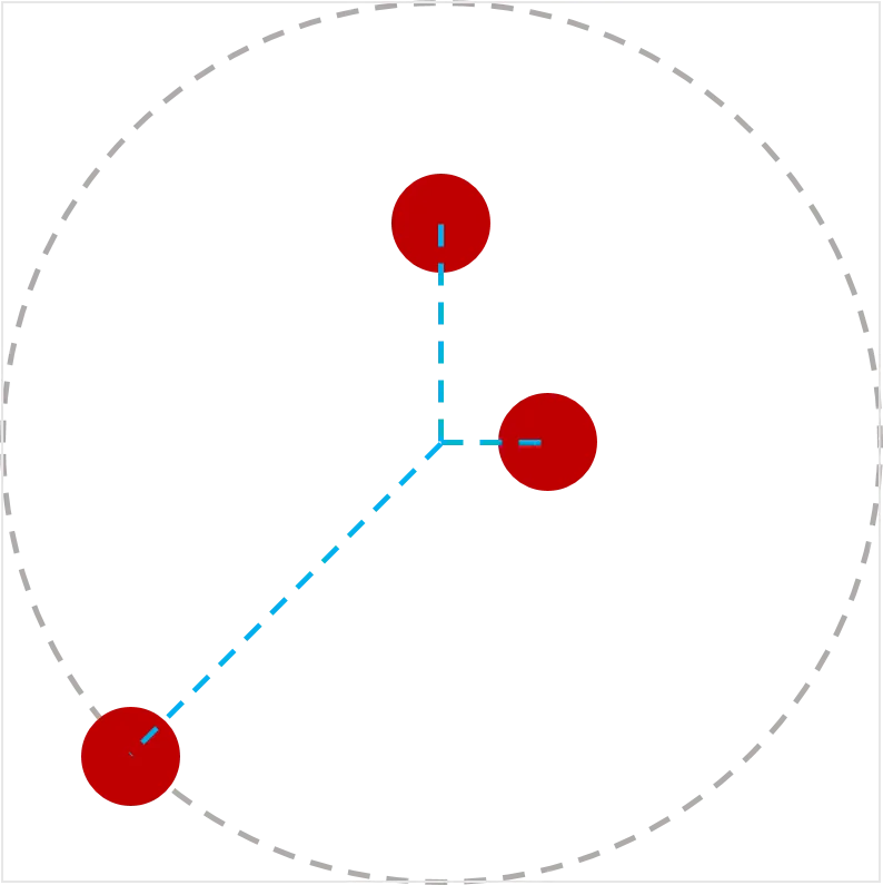
上面例子中,通过设定三个不同的offset-distance设定对应对象在路径上的位置分别为 50%, 20%, 100%。
那么对于 SVG 的几何图形,我们所设定的一些路径可能没有闭合,那么 offset-distance 设定超过 100% 会怎么样呢?
<style>
  .item {
    width: 100px;
    height: 40px;
    offset-position: 0% 0%;
    offset-path: path('m 0 0 h 200 v 150');
  }
  #box1 {
    background-color: red;
    offset-distance: -280%;
  }
  #box2 {
    background-color: green;
    offset-distance: 190%;
  }
</style>
<body>
  <div class="item" id="box1"></div>
  <div class="item" id="box2"></div>
</body>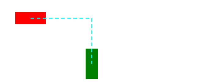
可以看到,两个分别设置在 -280% 和 +190% 的位置,最终由于路径没有形成闭合,两个对象停留在最小和最大的可达位置。
<style>
  .item {
    width: 100px;
    height: 40px;
    offset-position: 0% 0%;
    offset-path: path('m 0 0 h 200 v 150 z');
  }
  #box1 {
    background-color: red;
    offset-distance: -280%;
  }
  #box2 {
    background-color: green;
    offset-distance: 190%;
  }
</style>
<body>
  <div class="item" id="box1"></div>
  <div class="item" id="box2"></div>
</body>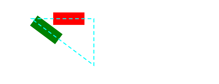
上面的例子则演示了闭合路径的状态,两个对象均可在路径上“循环”移动。
offset-position
offset-position 指定了路径本身的初始位置在哪里,可以提供属性值auto或者指定的位置。如果offset-position为auto并且position不为static,那么默认的offset-position则为position的位置。
<style>
  #wrap {
    position: relative;
    width: 300px;
    height: 300px;
    border: 1px solid black;
  }

  #box {
    width: 100px;
    height: 100px;
    background-color: green;
    position: absolute;
    top: 100px;
    left: 80px;
    offset-position: auto;
    offset-anchor: center;
    offset-path: ray(45deg);
  }
</style>
<body>
  <div id="wrap">
    <div id="box"></div>
  </div>
</body>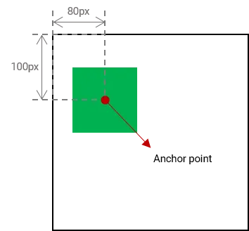
offset-anchor
需要移动的对象可能不一定得是对象的正中心,我们想要自定义对象的锚点,则可以通过offset-anchor来实现。
#plane {
  offset-anchor: center;
}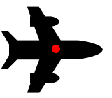
上面例子指定了对象的锚点在中心位置。
<style>
  body {
    transform-style: preserve-3d;
    width: 300px;
    height: 300px;
    border: 2px solid gray;
    border-radius: 50%;
  }
  .box {
    width: 50px;
    height: 50px;
    background-color: orange;
    offset-position: 50% 50%;
    offset-distance: 100%;
    offset-rotate: 0deg;
  }
  #item1 {
    offset-path: ray(45deg closest-side);
    offset-anchor: right top;
  }
  #item2 {
    offset-path: ray(135deg closest-side);
    offset-anchor: right bottom;
  }
  #item3 {
    offset-path: ray(225deg closest-side);
    offset-anchor: left bottom;
  }
  #item4 {
    offset-path: ray(315deg closest-side);
    offset-anchor: left top;
  }
</style>
<body>
  <div class="box" id="item1"></div>
  <div class="box" id="item2"></div>
  <div class="box" id="item3"></div>
  <div class="box" id="item4"></div>
</body>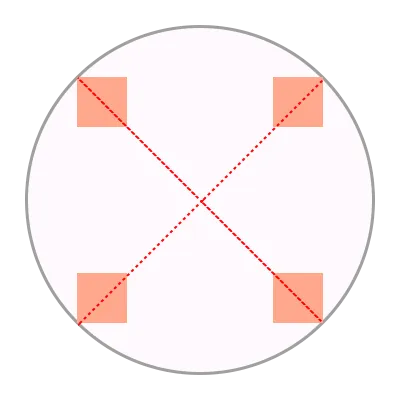
上面例子中指定了四个矩形的四个不同的锚点位置。
如果 offset-anchor 的属性值为 auto,有如下规则进行计算:
| 条件 | 结果 |
|---|---|
| offset-path: none; offset-position: 非 auto; | 取 offset-position 的值 |
| offset-anchor: auto; offset-path: none; | 与 background-position 行为相同 |
| 如果上述都不符合 | 取 transform-origin 的值 |
<style>
  body {
    width: 500px;
    height: 500px;
  }
  .box {
    background-color: mediumpurple;
    offset-path: none;
    offset-anchor: auto;
  }
  #item1 {
    offset-position: 90% 20%;
    width: 60%;
    height: 20%;
  }
  #item2 {
    offset-position: 100% 100%;
    width: 30%;
    height: 10%;
  }
  #item3 {
    offset-position: 50% 100%;
    width: 20%;
    height: 60%;
  }
  #item4 {
    offset-position: 0% 100%;
    width: 30%;
    height: 90%;
  }
</style>
<body>
  <div class="box" id="item1"></div>
  <div class="box" id="item2"></div>
  <div class="box" id="item3"></div>
  <div class="box" id="item4"></div>
</body>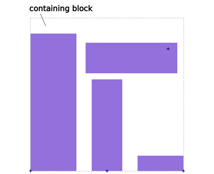
上面例子展示了,offset-anchor 为 auto 时,锚点的位置计算结果。
offset-rotate
offset-rotate 指定了对象的旋转角度或是如何自动旋转。
| 属性值 | 效果 |
|---|---|
| auto | 对象根据当前路径的朝向进行旋转 如果对 offset-distance 进行动画,对象也会随着当前点的朝向进行旋转 |
| reverse | 与 auto 效果相同,但与朝向相反 |
| 自定义角度 | 对象始终朝着一个方向旋转 |
当属性值为 auto 时,随着 offset-distance 的改变,角度也会自动改变
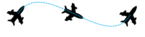
当属性值为 reverse 时,角度与朝向相反
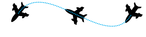
当属性值为 -45deg 时,角度始终不变
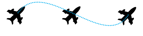
在线演示
- http://codepen.io/danwilson/pen/ZGmeRO
- http://codepen.io/yisi/pen/zGzJYd
- http://codepen.io/ericwilligers/pen/zGRdxQ
- http://codepen.io/ericwilligers/pen/pJarJO
- http://jsfiddle.net/ericwilligers/v79bdL3p/